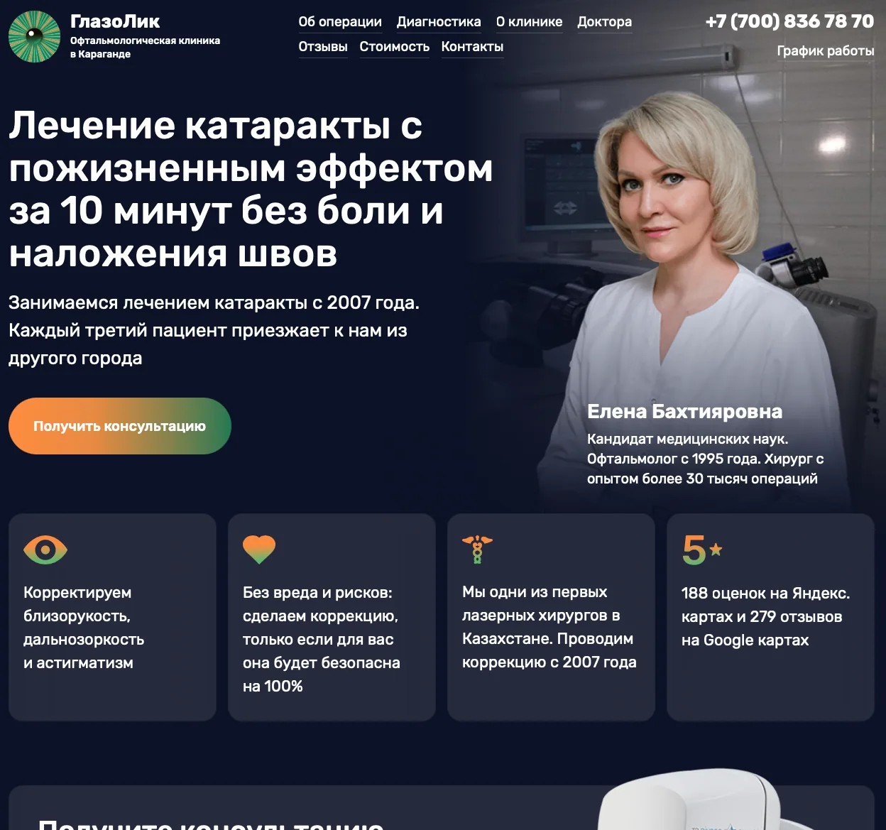
A typical LASIK landing page converts at 1–2%. This one converts at 8.3%. The difference goes beyond design. Before development, we interviewed prospective patients and discovered that their fear was rooted in uncertainty about the procedure. We built the entire page around that insight.
The problem: everyone sells surgery, yet nobody buys
A typical LASIK landing page reads: “Laser vision correction. Femto-LASIK in 15 seconds. Price: 250 000 tenge. Book now.” Clinics compete on laser speed and price. Conversion stays low because someone who has just discovered the procedure is still far from deciding to have eye surgery.
We interviewed people considering vision correction and found a paradox: most feared an operation they might never even be prescribed. They did not know why their eyesight was poor or which treatment would suit them. Yet they were already afraid of the laser.
“I had been putting it off for three years. I was afraid something would go wrong. It turned out I just needed an eye examination first, and all the panic disappeared.” — a Glazolik patient
An eye examination comes first
We offered people a manageable first step: an eye examination. This removed the pressure to commit to surgery. The whole page was built around that idea.
- Address pain with specifics: “At most, you may feel discomfort from someone touching your eyes for 10 seconds.” An honest, precise explanation is more credible than “completely painless”.
- Address fear of sight loss with a fact: “In 38 years, there has not been a single case of vision loss from laser correction worldwide.” The page presented this as a verifiable fact rather than a marketing promise.
- Explain protection against human error: “Even if you tried, you could not disrupt the operation: the computer tracks every movement of your pupil.”
- Show the options beyond LASIK: phakic lenses, Femto-LASIK and treatment for eye conditions. People see that their situation is individual and needs an examination.
The sentence that removes the biggest fear
The examination is described as a check across 30 parameters with a full report. The page explicitly states: “You can take this report to any other clinic.”
This addresses the unspoken fear of being drawn into a sales pitch and pressured to buy. When people know they can visit without any obligation, conversion rises.
Three CTAs for three levels of readiness
Some visitors have decided and want to book. Others have doubts and want to talk. Some dislike phone calls and prefer a message. The page offers all three options:
- “Book an eye examination” — for those ready to act
- “Get a consultation” — for those with questions
- “Message us on WhatsApp” — for those who prefer writing
Each CTA serves its audience, so no visitor is left without a suitable next step.
This was the second version
We had launched a simpler landing page earlier, without extensive audience research. We collected data, identified where conversions were lost and interviewed the chief physician and prospective patients. These findings informed the second version described above. Conversion increased several times over.
8.3% conversion and a 5 000 ₸ lead: what the figures mean
- Landing page conversion — 8.3%
- CTR of the ads linking to this landing page — 11%
- Cost per lead through Google Search — around 5 000 ₸
- Most enquiries are examination bookings (20 900 ₸), rather than direct surgery bookings: a deliberate strategy to widen the funnel
A principle for any expensive product
If a product feels frightening or expensive, offer an intermediate step that feels manageable, provides value in itself and lowers the entry barrier. For ophthalmology, that is an eye examination. For legal services, an audit. For renovation, measurements and an estimate. Conversion grows when the first offer helps people understand their problem before asking them to buy the solution.